The Map Gives a More Accurate View of the World!
The map of the world that is most commonly used today was designed in 1569 by Belgium geographer Gerardus Mercator (1512-1594) based on the sailing routes of that time. While this map is still the generally accepted image of our planet, it is flawed in that it dramatically distorts the sizes of the continents and the distance between them. So, an update was well overdue!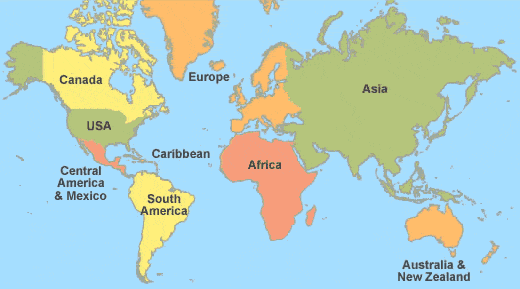
The world map most commonly used was designed in 1569 by Belgium geographer Gerardus Mercator (1512-1594) based on the sailing routes of that time.
The New World Map Attempts to Remedy Some Inaccuracies
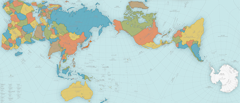
The AuthaGraph World Map was designed by Hajime Narukawa, the winner of the Grand Award in Japan’s Good Design Award in 2016. This new world map attempts to remedy some of the many inaccuracies in previous models.
It more correctly represents the distances between continents and displays the true size of countries and continents. For example, on the old map, Greenland looks to be about the same size as Africa when in actuality, Africa is about fourteen times the size of Greenland. Antarctica, which is depicted on old maps as covering a large and sprawling area, is now much smaller.
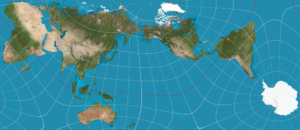
The AuthaGraph World Map, designed by Hajime Narukawa, won the Grand Award in Japan’s Good Design Award in 2016. The new world map attempts to remedy some of the many inaccuracies in the old model. It more correctly represents the distances between continents and displays the true size of countries and continents.
The New World Map is Used in Japanese Textbooks
This new world map is now used in Japanese textbooks. Hopefully, other countries will adopt this more realistic version of the world to provide both students and adults with a truer representation of the great globe on which we live.
Applications for the New Map
There are many applications for this new world map. For example, the size and shape of the ozone hole above Antarctica can more easily be understood, and it is visually clear you need to fly from Tokyo to Brazil via Houston!
But, its use is not limited to depicting coastlines. Take continental drift for instance: The 600 million year history of continent movements can be demonstrated with AuthaGraph. India, for example, can be seen breaking away from Madagascar, drifting across the Indian Ocean and colliding with Eurasia to form the Himalayas. Such geological themes can be visually expressed and easily understood.
This new map can also be used to plot historical events for a better understanding of world history. It is possible to show the routes of Colombus and other European explorers.


